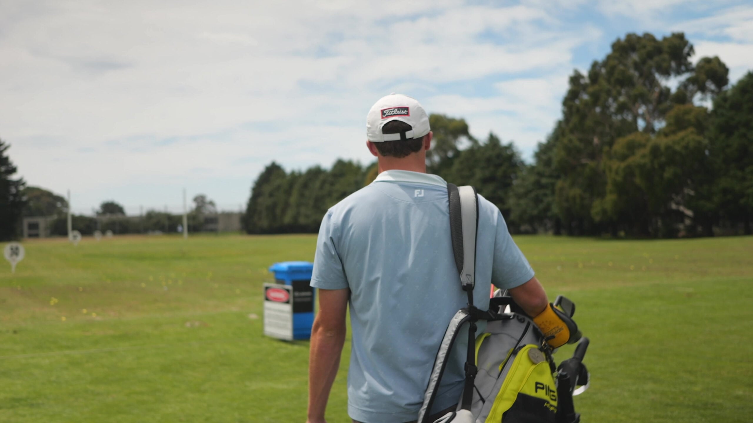
Golfer carrying a golf bag onto the course at Russley

// Russley Golf Centre / Website redesign

FIRST-CLASS GOLF.FROM THEFIRST CLICK.

A website that brings Russley’s golf, coaching and membership offer into one clear, premium experience.

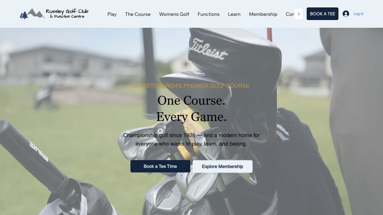
Russley Golf Centre website with its club identity, golf video hero and clear tee-time and membership pathways

Russley Golf Centre — a clearer introduction to playing, learning and membership. Screenshot of the live client website.

Client / LocationRussley Golf Centre
Christchurch, New Zealand

Platform / Project yearWix
2026

My roleWebsite design, content structure and Wix implementation
Dan Smith, Daniel James

// The brief

THE JOB
BEHIND
THE WEBSITE.

The brief wasn’t to invent a new Russley. It was to make the online experience feel like the Russley people already knew. A separately built centre website handled coaching and other activities, but its presentation sat apart from the club’s established identity.

There was also a practical split to consider. The centre website and the club’s DotGolf system served different jobs. The new presentation needed to help visitors understand the offer and reach the right next step, while respecting the booking systems already in use.

// The thinking

WHAT I CHANGED.
AND WHY.

Bring the club back into the picture.

I worked with the existing club logo and a revised light-blue and navy presentation. The aim was recognition, not a new identity: a centre website that visibly belonged to Russley. Existing photography and video gave the course and facilities the space to tell their own story.

Design around the golfer's next move.

A visitor considering a lesson needs different information from someone exploring membership or booking a round. I gave the course, learning, membership and functions distinct places in the structure, with prominent routes into tee booking. The site can introduce the experience without making every visitor follow the same path.

Improve the front door. Respect what sits behind it.

Lesson booking and Play, Learn and Fit content already existed. The rebuild focused on how that offer was presented and connected, with tee-booking links continuing into the club’s specialist DotGolf environment.

// The delivered work

When the experience is already good, the website's job is to make that quality obvious — and the next step clear.

An aligned visual direction

Club-led branding, a revised palette and a more considered presentation of existing course imagery.

A broader, clearer website structure

Dedicated information about the course, coaching, membership and functions, with navigation shaped around visitor intent.

A rebuilt Wix centre website

The new presentation on the centre domain, with visible routes into learning and established tee-booking services.

// The result

A BETTER
PLACE
TO START.

The delivered centre website now carries the club’s identity and gives its wider offer a more coherent home. Visitors can move from discovering the course to exploring coaching or membership, with tee booking clearly signposted.

The result is a centre website that introduces more of Russley through one consistent visual direction. The existing booking environment still does its specialist job, while the rebuilt site gives visitors more context before they enter it.

// Project questions

THE USEFUL
DETAIL.

Was the Russley Golf Centre project a full rebrand?

No. The existing club identity was the reference point. The work aligned the website’s logo use, colour and presentation with Russley rather than replacing the club’s brand.

Did the redesign replace Russley's DotGolf booking system?

The centre website connects visitors with the club’s existing DotGolf booking environment. I made tee booking easy to find alongside course, coaching and membership information, so golfers can explore the offer and move directly to the right next step.

What changed beyond the website's appearance?

The structure gives the course, learning, membership and functions clearer roles. Existing coaching and booking activity is placed within a more consistent club experience, so the website can explain the offer before directing a visitor to act.

// First-hand project account

Written by Dan Smith, the designer and builder behind Daniel James. A first-hand account of the website strategy, design decisions and completed work.

YOUR BUSINESS.
A BETTER
FIRST IMPRESSION.

Does your website reflect the quality of the business behind it? Tell me what needs to change. We’ll find the useful starting point.