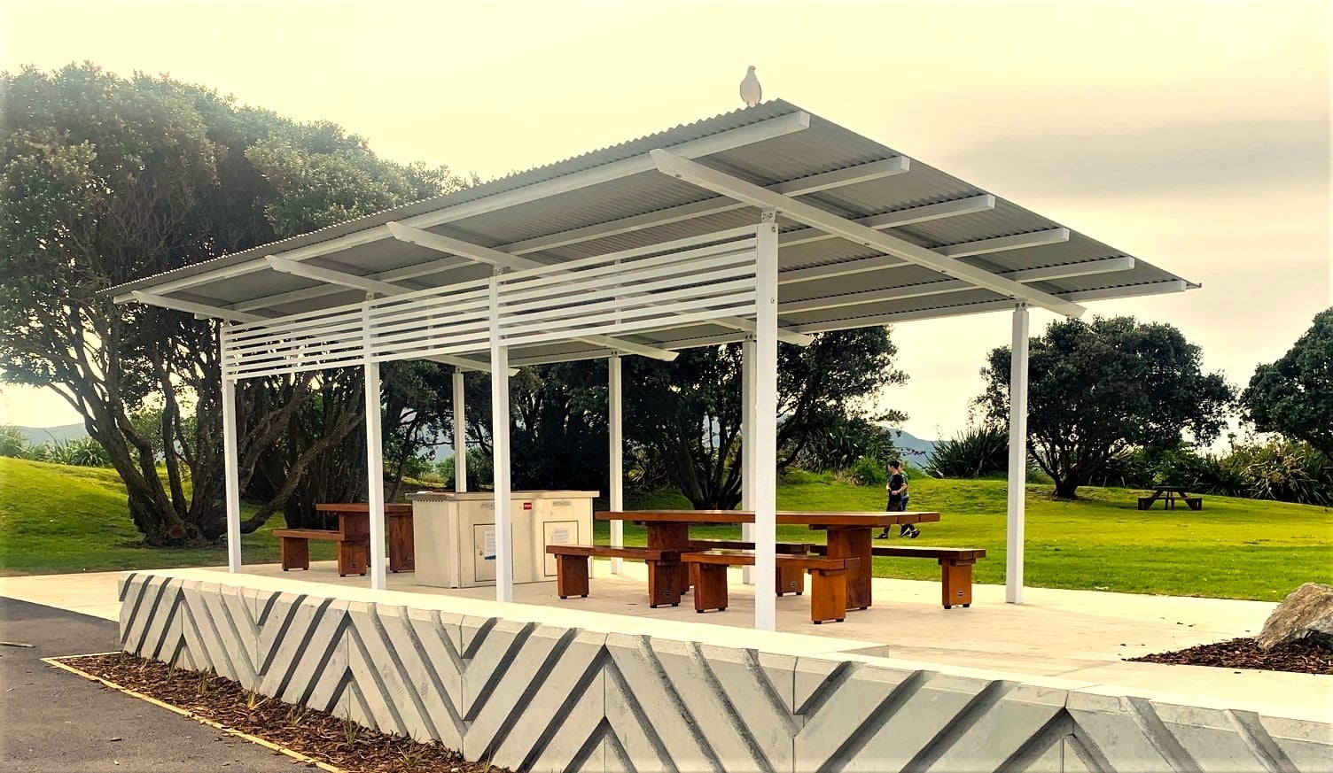
Solid timber picnic tables and seats beneath a park shelter

// Big Mac Slabs / Website redesign

SOLID FURNITURE.A CLEARERWAY IN.

Furniture, commercial projects and a Creative Centre worth visiting. One website with a clear route for each.

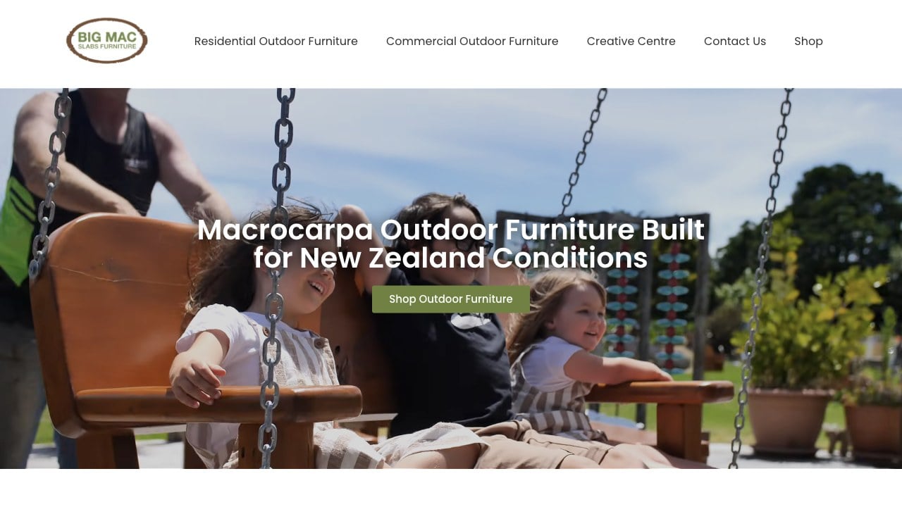
Big Mac Slabs website homepage presenting macrocarpa outdoor furniture, commercial furniture and the Creative Centre

Big Mac Slabs — furniture, the Creative Centre and aftercare brought into one clear website.

Client / LocationBig Mac Slabs Furniture & Creative Centre
Paraparaumu, Kāpiti Coast, New Zealand

Platform / Project yearWordPress + Elementor + WP EasyCart
2026

My roleWebsite structure, content refinement, design and WordPress build
Dan Smith, Daniel James

// The brief

THE JOB
BEHIND
THE WEBSITE.

Big Mac Slabs makes macrocarpa furniture in Paraparaumu for homes and commercial spaces across New Zealand. Its Creative Centre brings another part of the business into view: furniture displays, gardens, galleries and work by local artists. Someone choosing a backyard table arrives with a different question from a school planning outdoor seating or a visitor looking for something to do on the Kāpiti Coast.

The previous website already contained a substantial business story, a store, brochures and useful care information. The homepage gave much of its space to the company’s history and values. I rebuilt the core pages around the decisions visitors need to make first: what Big Mac builds, whether it suits their setting, how to explore the range and how to get in touch.

// The thinking

WHAT I CHANGED.
AND WHY.

Give each audience a clear starting point.

I made residential furniture, commercial furniture and the Creative Centre distinct routes in the main navigation. The residential page introduces the furniture range and custom options. The commercial page addresses hospitality, public spaces, retirement settings, early childhood centres and schools. The Creative Centre has room to explain the visitor experience and practical details. Each part of the business can make its own case while remaining connected to the whole.

Start with the product and show it in use.

The new homepage leads with macrocarpa outdoor furniture and its use in New Zealand conditions. Furniture photography and existing video give that promise a setting people can recognise. I used imagery, layout and clear category treatments to introduce the range and show how the furniture fits different spaces. The result puts the furniture and its uses in front of visitors before asking them to read further.

Treat aftercare as part of the customer journey.

The maintenance videos were an explicit client priority because customers used them regularly. I brought those resources into the rebuilt site and added a maintenance link to the shared footer, making care information available beyond the residential page. The care page brings instructions, the maintenance sheet and coating products together. That supports an existing owner with a practical question as well as someone considering their first purchase.

// The website work

Furniture, visits and aftercare. One clear way forward.

A rebuilt core website.

I designed and built the new WordPress and Elementor pages for the homepage, residential furniture, commercial furniture and Creative Centre. The shared navigation and footer connect those pages with shopping, enquiries, brochures and care. Contact details and location information provide a consistent route back to the business.

Clearer content around the catalogue.

The core pages now introduce the range through recognisable furniture types and buying situations, with links into the existing shop and contact routes for custom work. I also supported catalogue updates as the client supplied product information and imagery. The website gives people context for browsing the products and discussing a project.

A place for the wider destination.

The Creative Centre page explains the workshop, gallery spaces, gardens and local creative work, alongside the details people need to plan a visit. Furniture care remains accessible through the footer and its own page, giving the site a useful role before a purchase, during a visit and after furniture reaches its new home.

// The result

A BETTER
PLACE
TO START.

The redesigned core website is live at bigmacslabs.co.nz. It presents the furniture business and Creative Centre through distinct, connected pages, with a direct shop route and visible care information. Visitors can start with their own purpose and follow the relevant detail.

The website supports the business beyond the first visit. Buyers can explore the range and discuss custom work, Creative Centre visitors can plan their trip, and existing owners can find the information they need to care for their furniture. Those different needs now sit within one clear presentation.

// Project questions

THE USEFUL
DETAIL.

What did Daniel James do for Big Mac Slabs?

I handled the core website structure, content refinement, design and WordPress build, working with the client on imagery and layout. I also supported product catalogue updates and brought the existing maintenance resources into the new presentation.

How does the site serve furniture buyers and Creative Centre visitors?

Residential furniture, commercial furniture and the Creative Centre have separate starting points. Buyers can explore relevant uses and products, while visitors can find out about the galleries, gardens and practical details for a visit.

What platform does the Big Mac Slabs website use?

The website uses WordPress and Elementor, with the existing WP EasyCart shop connected to the redesigned pages. I also supported updates to the product catalogue.

// First-hand project account

Written by Dan Smith, the designer and builder behind Daniel James. A first-hand account of the website strategy, design decisions and completed work.

YOUR BUSINESS.
A BETTER
FIRST IMPRESSION.

Does your website reflect the quality of the business behind it? Tell me what needs to change. We’ll find the useful starting point.